BYTE Magazine Covers and a Gentler Way to Imagine the Future
What Robert Tinney’s paintings reveal about early computer culture and what we lost when tech stopped being illustrated.
Before the internet taught us to look for the future inside a black mirror, it arrived in softer formats.
It arrived as a brushstroke.
It arrived as a metaphor.
It also arrived as a BYTE magazine cover that looked like it had been made by someone who believed technology was strange, but not evil.
Someone who believed the future would be complex, but maybe still be bright.
The early digital-age aesthetic and why BYTE mattered
The early digital age did not have a single “tech look” yet. There were no default UI gradients. No clean startup minimalism. No identical product pages with the same three lifestyle photos.
Computing was still new enough to feel like a weird hobby and important enough to feel like a new world.
BYTE sat right in the middle of that. It was the magazine you picked up when you wanted to understand what was happening without being treated like an idiot. It did not read like a brochure. It read like a field guide for a culture that was forming in real time.
There was no stable “digital aesthetic,” yet, so illustrations did a lot of heavy lifting. A painting could make an invisible concept feel physical.
A cover could turn “networks” into a place. It could turn “AI” into a mood. It could turn a technical topic into something you could recognize before you understood it.
Early Digital Futurism was made with human tools—brushes, texture, humor, metaphor. The future came across as something you can approach, not something that approaches you.
If today’s tech imagery often feels like it is trying to hypnotize you into compliance, BYTE’s cover art did the opposite. It made the future look negotiable
The Artwork that shaped what “computer culture” looked like
BYTE magazine ran from 1975 to 1998 and earned its place because it treated personal computing as culture, not a product category.
It also met readers where they actually were: curious, slightly overwhelmed and trying to figure out what these machines were about.
But what we all remember, even decades later, is not the table of contents.
It’s the covers.
If you ever stumbled across BYTE on a shelf, you know: It was a computer magazine, yes, but it was also a monthly showcase.
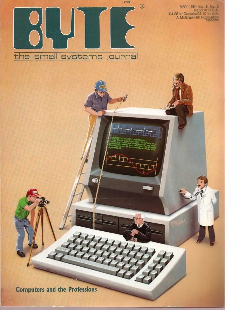
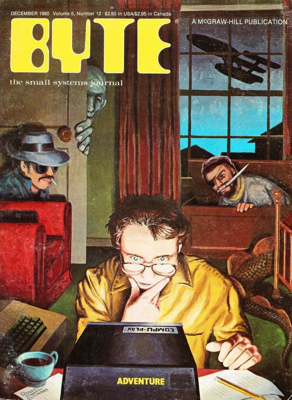
For a big stretch of BYTE’s run, the cover art was created by illustrator Robert Tinney, whose work became synonymous with the magazine’s visual identity.
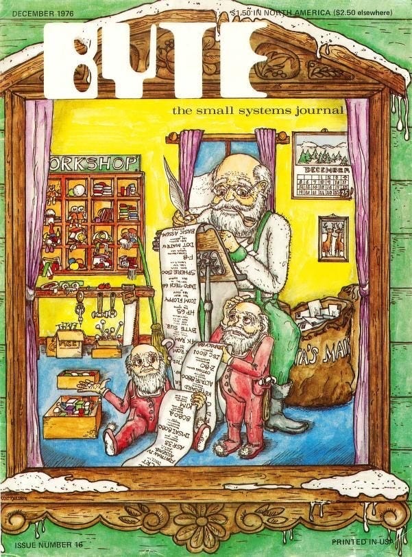
Robert Tinney was approached early on and his first cover appeared on the December 1975 issue.
The timing matters.
Personal computing was still forming its personality in public and most people still didn´t yet have a mental picture of what this new world even looked like.
Tinney’s job was to make it visible so he became the visual translator for that shift and helped create that image.
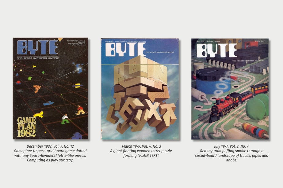
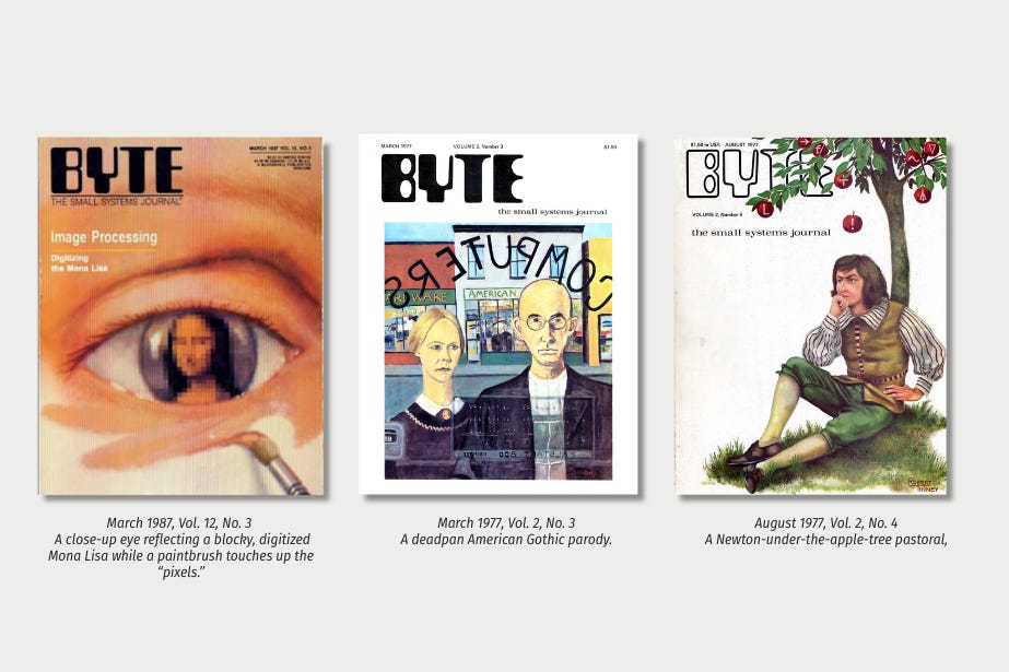
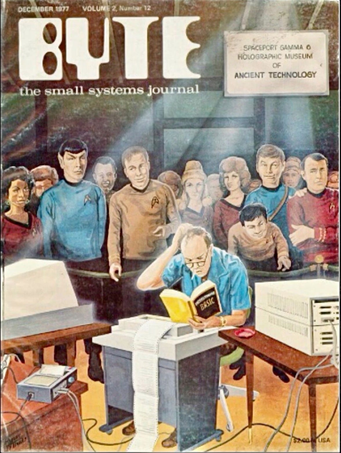
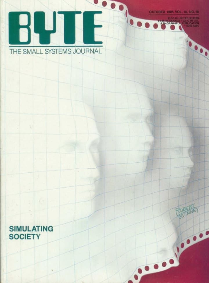
A quick gallery of the most iconic BYTE Covers
Once you start looking, you notice Tinney keeps repeating a few visual moves that make abstract tech feel strangely human. Tinney’s covers rarely show a “computer” as a product. They show a computer as a character in a bigger world.
One recurring move is scale. Sometimes computing is pictured as something cosmic and abstract—grids, space and systems.
Other times it is personal: a person, a face, a hand, a room. The message is subtle but consistent. This new technology is huge, but it is also coming home with you.
Another recurring move is metaphor.
Networks become landscapes. Intelligence becomes a game. Software becomes architecture. Even when the topic is complicated, the picture makes it feel graspable. You do not need to understand the technical details to understand the vibe: curiosity, caution, and a weird sense of play.
And then there is the humor. BYTE covers were allowed to be slightly odd, sometimes even silly, without losing credibility. That is a lost luxury.
Today’s tech imagery is rarely funny, because modern tech culture is terrified of looking unserious. Tinney’s era understood the opposite: humor is part of how humans process change.
Where to find BYTE covers
Here are the best places to start:
Zoomable BYTE visual archive the fastest way to get a full “shelf view” of decades of covers, then zoom in and pick your favorites.
Internet Archive Large collections of BYTE issues and individual issue pages
VintageApple’s BYTE scans cleaner browsing and quick access when you want to track down specific issues without getting lost.
Robert Tinney’s Shop the artist’s own archive + prints.
If you want more context straight from Tinney himself, there’s a 2006 interview with him on Vintage Computing.
Back when the Future still had texture
BYTE’s future came with the quiet confidence of analog media. The cover art could not afford nothingness and needed an unique composition that could survive a whole month on a newsstand.
Tinneys artworks where done by hand and consisted of drawn illustrations with tissue paper, oil painting and designer wash and airbrush. His covers sold a feeling, instead of staying strictly technical.
They brought unfamiliar technology closer to readers who were living through a transition.
The covers did not scream: “Everything is changing and you are behind“.
They said: “The future is here. Join in.”
They turned computing into worlds you could enter: architecture, landscapes, games, little visual jokes that made the future feel approachable.
And then the aesthetic shifted. At a certain point, tech stopped being illustrated and started being marketed. The future got cleaner, flatter, more “professional.”
End of byte magazine and what that means for us
Around 1987 Tinney’s paintings gave way to product photography—less metaphor, more marketing.
The much-loved BYTE Magazine stopped its publication after the July 1998 issue, when new owner CMP Media abruptly shut down the 23-year-old magazine and apparently laid off nearly the entire staff.
Magazines used to slow you down in a good way. You opened them to spend time with something. You took them with you, you flipped, you paused, you got distracted by a weird illustration or a headline you did not expect.
BYTE covers read like cultural fossils in the best way and represent a time where the future was allowed to be rendered by artists instead of product teams.
If we talk about the return of to analog, I’d also love a return of people still believing technology needs to be explained through metaphor and craft. We replaced that with interfaces designed to be self-justifying and self-erasing.
Catch you next time,
Sarah


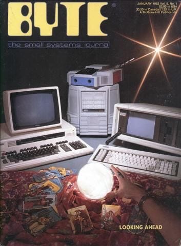
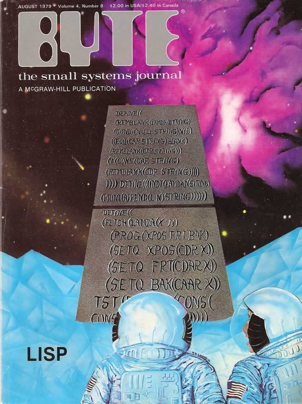
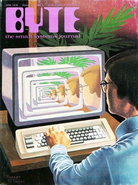

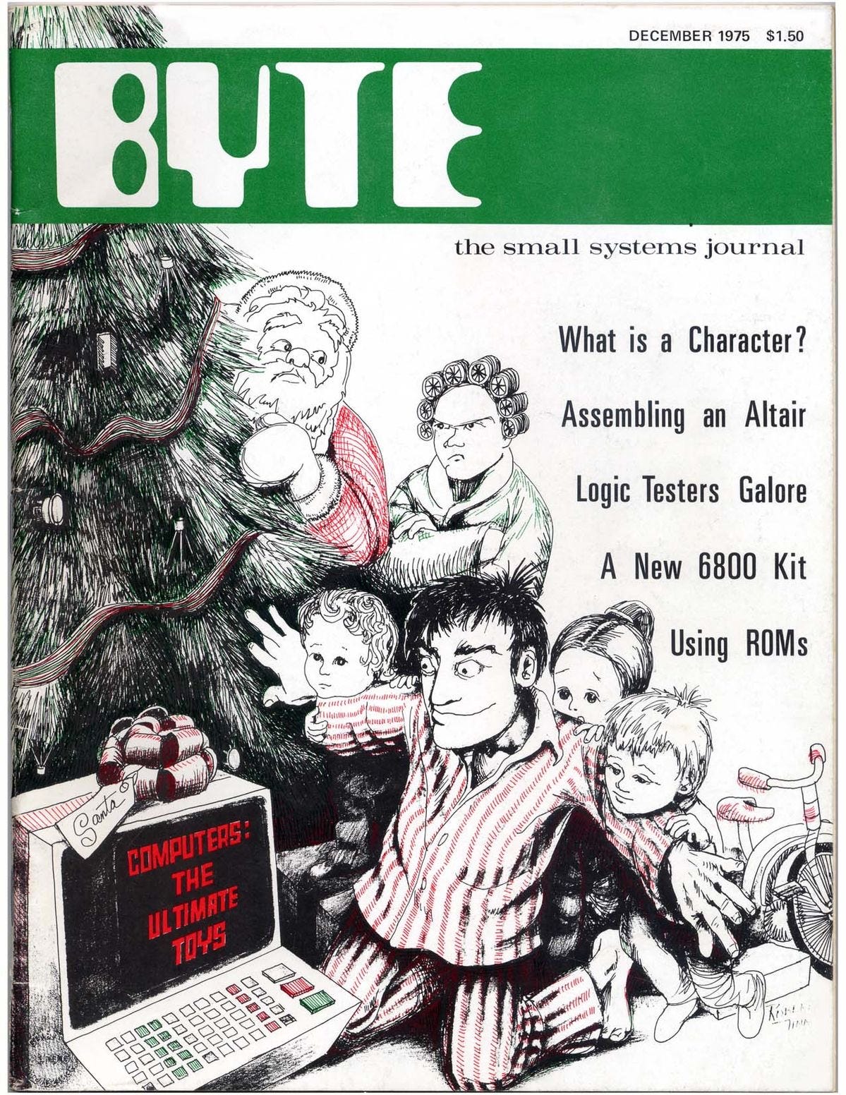
Wonderful write-up of a wonderful time in our lives. I've been a magazine junkie since I was very young - I sorta keep wishing there was a towering AI Magazine and AI Week like the old PC Week and InfoWorld that I eagerly awaited in the mailbox. I didn't understand half of what they said, but I loved them just the same. I do pick up occasional $15 special editions on AI, etc., and I know it all can be served up by imperfect Flipboard or if I dedicated myself to diving into a creation via AI. I get digital magazines, of course, and the benefits are many. But maybe Digital Paper one day will finally be a reality, and my Now Edition grand vision reality - as deep and fun as books/magazines but as up to date as today. I'll be possible, in fact it already sort of is. Will we go there?
As someone researching depictions of social media an in teen/youth films, I found your analysis fascinating and really insightful. Bookmarked for future reference. Thank you!