🛸 The Orbit Dispatch - Issue #12
New month, new rabbit holes.
Hello!
December’s here, and the internet put on a sweater but stayed weird. This month serves as a quick tour of design curios, pop-culture debris, and a fun MySpace rabbit hole.
🌟 Fresh Orbit: Creative News & Quick Takes
On November 1, Squarespace pulled a large set of Monotype fonts from its platform. Because Monotype controls libraries like FontFont, ITC, and Linotype, the change hit tons of sites at once. Likely a cost-cutting move after Squarespace’s PE acquisition, it’s the latest battle in the font-licensing wars. Call it the “Great Font Divorce”: a spreadsheet decision that breaks brand consistency and makes designers scramble for replacements.
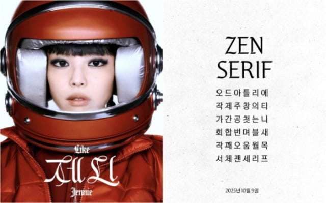
As a perfect counter-point to the closed-wall corporate drama, November also saw a major “creator-led” font release. Jennie of the K-Pop group Blackpink released “Zen Serif”. The artifact itself is notable: it is a high-quality, free-to-download typeface, primarily for Hangeul (Korean) but including a “surprisingly nice” and robust Latin character set designed by Leo Type.
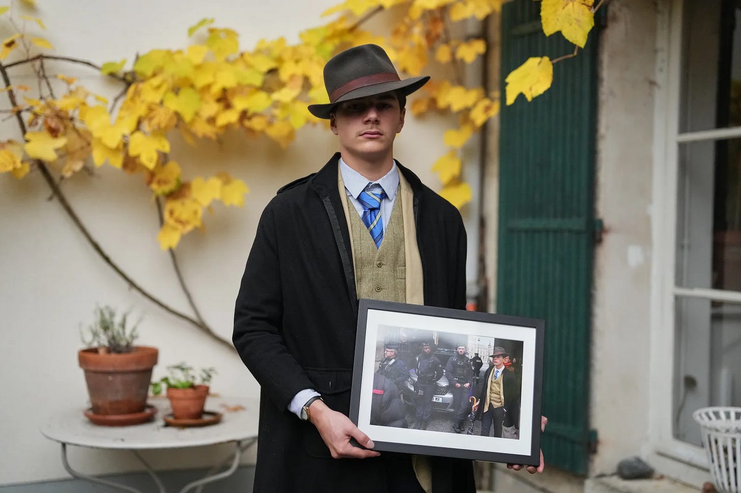
Following a heist of the French Crown Jewels at the Louvre, the internet became obsessed with a bystander in a viral photo dubbed “Fedora Man.” The Theory: Was he a time traveler? The mastermind? A film noir ghost? The Reality: The ‘Fedora Man’ turns out to be... a teenager named Pedro. He stayed silent for days to “let the mystery simmer.” “I like to be chic,” he said. “I go to school like this.”
LG launched the ‘AeroCatTower,’ a $1000+ heated throne for your cat that also cleans the air. Peak servitude achieved.
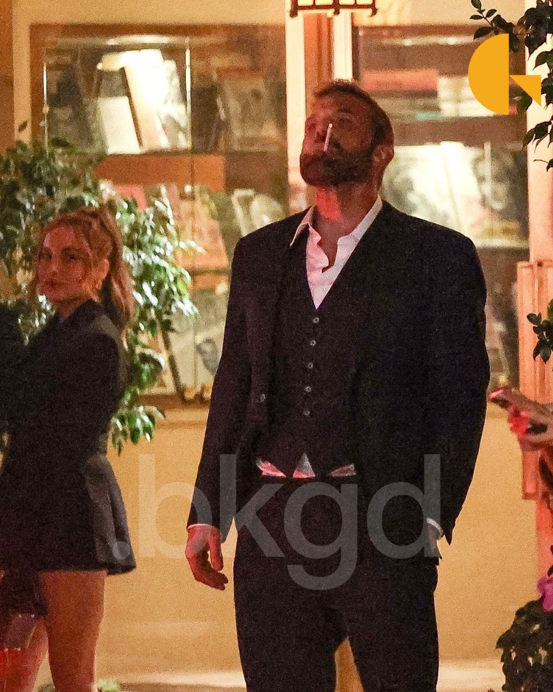
The month’s defining mood was delivered via paparazzi photos of Ben Affleck. A new image of the actor, this time “dressed in a three-piece suit with his shirt partially unbuttoned,” went viral. The photo, which captured him “lost in thought” and “perfect[ing] the art of looking done with everything” while smoking outside a hotel, sparked an immediate “meme-frenzy”.
This artifact is the 2025 spiritual successor to “Sad Affleck.” It represents the ambient, existential mess: a visual shorthand for the collective “existential meme scroll” of late 2025.
Affinity rolled out a new brand in early November 2025. The free plan stole most headlines, but the identity itself really landed with designers. Unlike Cracker Barrel’s top-down nostalgia tweak, Affinity built the look with its community: the cheeky “fresh.af” line (Affinity = af) sets a knowing, slightly out-there tone. The work was a joint effort across Affinity, Canva, and Twist, with a Rob Clarke logotype and a custom Ohno typeface. Because the process matched the promise: “for creatives, by creatives” and the response was largely upbeat: fresh, fun, and fit for how people actually use the tools.
RIP Messenger Inbox ads. Facebook is killing the ad placement on Nov 11, forcing marketers to be slightly less invasive.
The primary aesthetic resurrection of November 2025 is “Frutiger Aero”. This is the design language of the early 2000s, defined by “techno-optimism,” “glossy buttons, water reflections and blue skies”. It’s the aesthetic of Windows Vista, early social media, and a pre-minimalist internet. Its resurgence is not random. It is being explicitly championed as a “visual antidote to today’s overly flat design styles”. This is a conscious, creative rebellion against the “blanding” of corporate minimalism: the very aesthetic that Cracker Barrel just tried, and failed, to adopt. Creatives are fleeing the “flat” present by embracing a “glossy” past.
That ‘We from the same place’ trend is the internet finding its hivemind over ‘oddly specific, deeply relatable moments.
The nostalgia cycle is now officially eating its own tail. A November 13 article in Dazed documents how fashion is “stuck in an endless remix of bygone eras”. The prime artifact of this is the return of Kylie Jenner’s “King Kylie” persona, the “quintessential 2016 baddie”. The analysis notes that the nostalgia cycle is so broken that all eras are happening at once, from 2015 “Jason Derulo” outfits to Y2K butterfly tops. This “stylistic déjà vu” is framed as “comfort in trying times”. The culture is not just remembering 2016; it is actively retreating to a pre-pandemic, pre-AI-anxiety moment of perceived “main character” social media energy.
The month’s “high-brow” expression of this retreat is the launch of the new “Tutankhamun Spatial Archive” by Oxford University’s Griffith Institute. This is literal digital archeology. The new, searchable, high-resolution database was launched to mark the exact 100th anniversary of the unwrapping of Tutankhamun’s mummy in November 1925. The archive is a digital resurrection of one of the “most detailed archaeological archives ever assembled,” including thousands of photos, object cards, and drawings.
Kickstarter Weirdness: ‘The Uprising’ is a board game about Teutonic Knights vs. Heathen Prussians. Very specific. Very intense.
Devine officially announced the long-awaited comeback of Vine, triggering a surge of excitement across social platforms. In its first wave of user reports, the team confirmed 10,000 early users already onboard. Early feedback highlights strong nostalgia and growing creator interest. Notably, Devine stated that the platform will ban AI-generated content, positioning itself as a space for human-made creativity and authentic expression.
🔗 Curated Links: Oddities & Inspirations
deathgenerator.com
Highly addictive generator that lets you write your own dialogue into vintage game scenes.
A human-curated feed of the internet’s strangest, smartest hidden sites, delivered every weekday. No AI, just one person digging up genuinely useful, odd or inspiring links from the deep web. Surprisingly rich for creative inspiration.
An Electic Libary
A minimal, old-web archive collecting rare and unusual books across history, philosophy, medieval and eccentric niche topics. A quiet, fascinating library of digital oddities. Great for inspiration, research or mind-wandering.neocities.org
A sprawling network of over a million personal websites bringing back the weird, handcrafted creativity of the early web. Zero ads, zero data selling!A mysterious internet classic: wherever you point your cursor, the site finds a photo of someone pointing right back at you. The tiny delay adds just enough drama to keep it weirdly hypnotic
A curated time capsule of iconic Flash games and animations—preserved and playable in your browser via emulation lets you browse flash games by year. Found via randomdailyurls.com (Newsletter Recommendation)
A procedurally generated, endlessly rolling night highway. Meditative, slightly eerie and perfect for losing yourself for a few minutes (or more).
⁉️ Questions No One Asked (But We Answered Anyway)
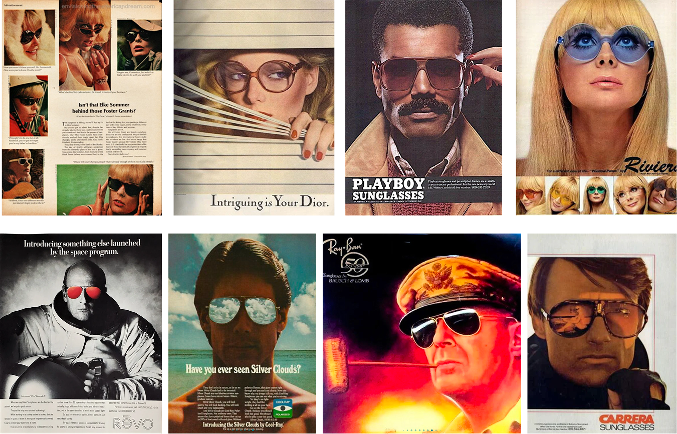
What was the obsession with putting sunglasses on animals in early advertising?
From the late 70s through the 90s, sunglasses were the fastest shortcut to “cool.” Put a pair on a mascot and you didn’t need a backstory: instant swagger, a hint of rebellion, job done. It worked because shades carry real cultural baggage: rock stars, mystery, don’t-look-at-me-but-also-look-at-me energy. Hide the eyes and you create distance and intrigue; add a cute animal and you soften it just enough for mass appeal.
Anthropomorphism did the rest. Animals grab attention, feel friendly, and stick in memory; sunglasses stamped them with attitude. That’s how we got Spuds MacKenzie’s party-dog myth and Chester Cheetah’s too-cool-for-school persona. Brands chasing youth audiences loved the formula: fun, a bit naughty, endlessly merchable.
Of course, the trick got overused. By the late 90s, “animal + shades” read either effortlessly iconic or trying-way-too-hard. And it wasn’t universal. In some markets, the concept doesn’t translate—cultural norms around animals can make the gag feel off or even disrespectful. What felt like play in the U.S. could miss the mark elsewhere.
Sunglasses weren’t just props; they were a cultural code. When brands paired that code with an animal mascot, they borrowed cool, built quick trust, and sold a mood. Today’s revival (from emoji 😎 to ironic retro packaging) proves the symbol still works: use it with intention, not as a default.
🦴 Internet Archaeology
MySpace’s strangest celebrity profiles and their custom CSS chaos (a tiny museum tour)
MySpace let you paste CSS right into your “About Me,” which sat in the middle of the page: not the <head>—so profiles loaded as a flash of butt-ugly content before the styles kicked in. Everything was tables inside tables, random element names like lightbluetext8, glitter GIFs, autoplay songs, Comic Sans on neon. It was lawless—and iconic.
Greatest hits, briefly:
Kim Kardashian (“kimsaprincess”): wall-to-wall pink, Comic Sans, princess era turned up to 11.
Lana Del Rey (as Lizzie Grant): fireworks, glitter, and proto-Lana obsessions (poison, motorcycles, morphine).
Kendall Jenner (“horsegirlkj”): the username that launched a thousand winces.
Kesha (2008): feral, funny, unfiltered bio energy—exactly the chaos she later sold as hits.
Katy Perry — Neon hero photo, fuchsia links, Friend Space full of era icons. Like a CD booklet exploded: bright, bubbly, comment-bait.
Lady Gaga — Black/cyan club theme with silhouette logo and event widgets. Early DIY pop-star branding—half flyer, half diary.
When MySpace finally killed custom CSS in 2010, people were mad—but it saved eyeballs. Facebook later tested profile colours and proved the same point: unlimited freedom often looks… bad. Those chaotic celeb pages are perfect time capsules of the pre-“personal brand” internet—messy, human, and weird in ways a template never will be.
❌ Branding & Campaign Fails
Downyflake Toaster Eggs
Downyflake Toaster Eggs were a 1970s attempt to answer the question nobody asked: What if breakfast tasted like regret and the inside of a well-used Tupperware left in someone’s car?
They were basically frozen, rubberised egg pucks you were expected to drop into a toaster - because apparently the 70s were a lawless time when “protein cooked by radiant heating coils” sounded sensible.
Predictably, they came out looking like industrial insulation and chewing like a stress ball that had seen things. The product died almost instantly, partly because toasters are terrible at heating eggs, and partly because microwave ovens showed up and said, “Absolutely not, you morons.” Today they live on only in nostalgic lists of “Foods That Should Never Have Happened,” right next to toaster bacon and every other culinary war crime of that decade.
🎟 Bizzare Packaging Designs
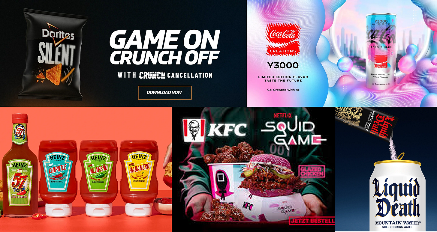
Holiday season is here, which usually means every brand is stress-wrapping itself in sparkles, limited editions, and questionable creative decisions. So let’s take a look at this and last year’s packaging drops, all of which are less Silent Night and more Mean Girls Jingle Bell Rock performance.
In June 2025, KFC Germany dropped a limited “New Korean Chicken” menu tied to the final season of Squid Game: pink-bun burgers, Korean-glazed wings, and buckets/boxes dressed like series merch. The vibe? Street-food meets dystopia meets fried-chicken comfort, all wrapped in pastel-pink packaging that looks more like a hype-drop than takeout. Oh, and it wasn’t available in the US.
Liquid Death – “Death Dust” Kids Drink Mix
A hydration powder dressed like it’s auditioning for a metal album cover. Moody, high-contrast graphics for a product that’s… basically electrolytes.
Coca-Cola Y3000 “AI Flavor” Bottle
Vaporwave gradient fever dream generated “with AI.” Looks like a soft drink from the metaverse vending machine that no one asked for (but everyone still bought).
Bright-neon, flame-coded bottle that’s part hot sauce, part visual assault.
Bonus (since it’s not actual packaging):
Not an actual retail chip. It’s a concept built around “software-assisted silent crunching” for gamers, meaning it literally listens for chewing sounds and cancels them out in real time.
📣 What’s New:
We have a Sale! Last few days of our Winter Sale, go check our our templates!
Exclusive Member Resources: More articles, templates, and creative tools added to our premium content library. Subscribe!


