




Hello!
A month of resurrected trade shows, elderly Happy Meals, fast-food lamps and further evidence that culture is currently travelling backwards at approximately 56k modem speed.
In this issue:
Burger King welcomes the boomers
Tinder gets back on the apps
E3 rises from the dead
Fast-food bags become expensive lamps
Brands desperately try to become culture
The Designers Republic turns 40
Another artifact from the physical-media graveyard
🌟 Fresh Orbit: Creative News & Quick Takes
Coca-Cola decided it needed to look more like Coca-Cola. On 20 July, the brand unveiled a new global identity by JKR, bringing back and exaggerating the stuff everyone already knows: the Dynamic Ribbon, Arden Square, Spencerian script and a lot of very loud red and white. Coke Zero also gets pulled closer to the main brand, just with more black. Basically: one of the most recognisable brands on Earth has been rebranded to look more recognisable. Brave.
Burger King Invented the Happy Meal for Lower Back Pain: Kids have had decades of tiny toys with their fast food. Burger King France finally asked the important question: What about people who remember dial-up? The Boomer King is essentially an adult Happy Meal filled with 80s and 90s nostalgia. Instead of a plastic Minion, you might get Saved by the Bell socks, a Knight Rider T-shirt, a Charmed mug or a Beverly Hills 90210 glass. The campaign leans completely into ageing, complete with bald spots, aching backs and flying wigs. Is it shameless nostalgia bait? Absolutely. Would we like the mug? Absolutely, yes.
McDonald’s Bags Have Entered Their Noguchi Era: British artist Benjamin Slinger spent decades collecting old fast-food paper bags. Which sounds like the beginning of an intervention. Instead, he turned them into lamps. His Empire series transforms vintage McDonald’s, Burger King and other takeaway bags into sculptural lanterns inspired by Isamu Noguchi’s Akari lights. The result is weirdly beautiful.
Tinder got its first major rebrand in almost a decade. Porto Rocha gave it an all-caps wordmark, refreshed flame, new typography and a much more editorial visual world mixing anime, paintings, memes and various bits of internet culture. More importantly, it finally seems to acknowledge that dating is not just beautiful people drinking cocktails on rooftops. Sometimes it is staring at “hey” for six hours wondering if replying will ruin your life.
Granola is fighting AI slop by trying to look like an actual human made it. On 23 July, Ragged Edge revealed a new identity for the AI meeting-notes app that deliberately avoids the usual glowing gradients, mysterious orbs and “future of productivity” nonsense. Instead it is warm, messy, witty and handmade. An AI company has discovered personality. Huge development.
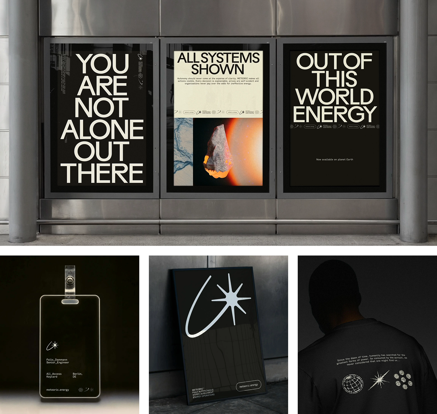
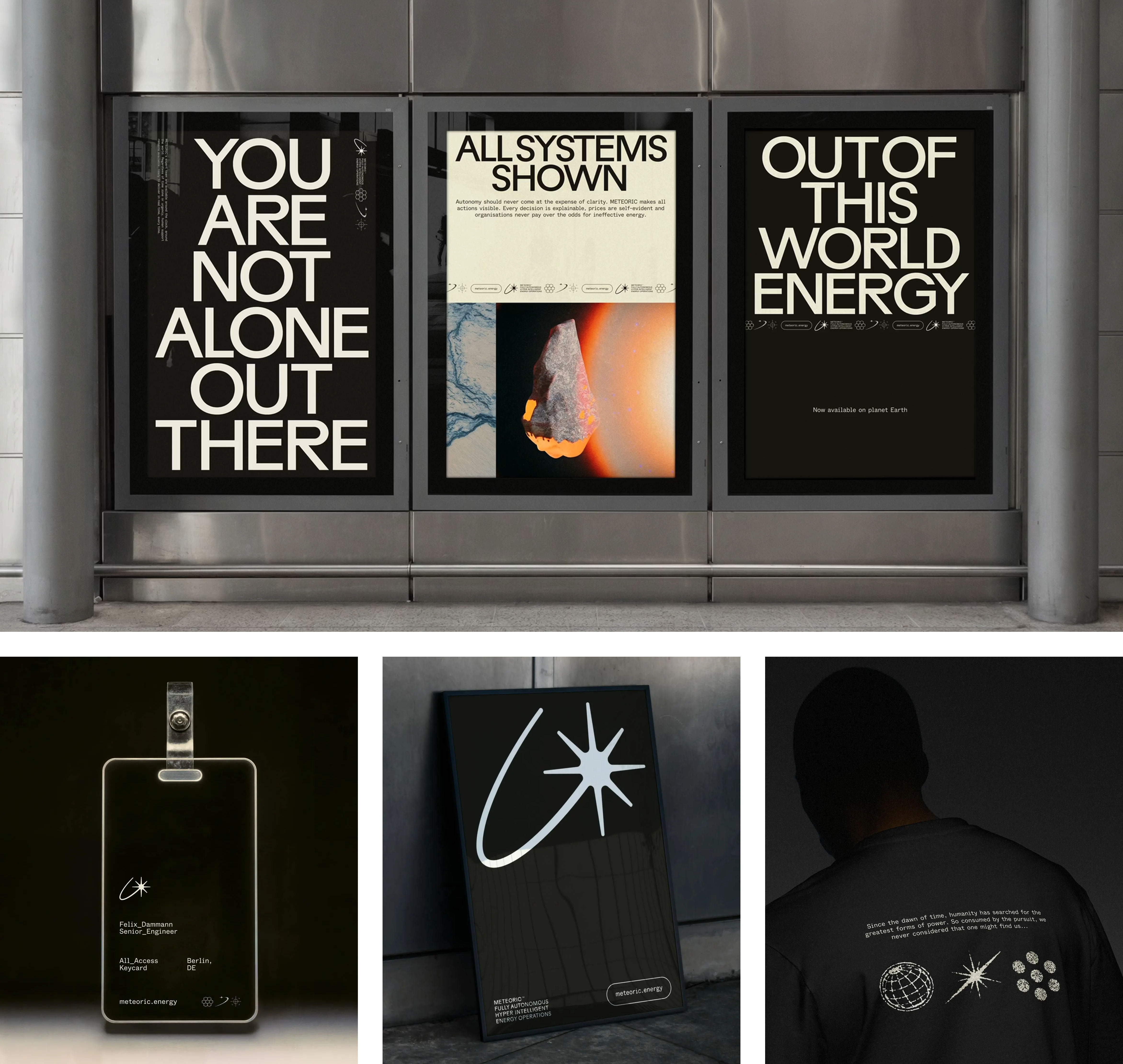
An AI energy company has gone full 1960s sci-fi paperback. On 22 July, How&How rebranded German energy supplier Zeus Energy as Meteoric, with cosmic symbols, modular graphics and a whole visual language inspired by old science-fiction books. Even the copy system uses a custom LLM. Personally, if my electricity provider does not look like it is about to invite me onto a spaceship, I am no longer interested.
Koto launched its own type foundry. On 8 July, the studio introduced CCType, after apparently getting tired of existing fonts not doing exactly what they wanted. The first release, CC Timeline, is designed to work across complicated brand systems and loads of different applications. Another design studio has started dealing fonts. Keep an eye on your children.
Florence’s first art-book fair went full doodle. Its July identity uses hand-drawn type and illustrated logos rather than the extremely serious, extremely tasteful design language these things usually come with. Another small victory in the ongoing war against making everything look like a Scandinavian bank.
A museum made a typeface out of its own stuff. In late July, the Horniman Museum in London revealed a campaign where bespoke letterforms are built from actual objects, specimens and plants in its collection and gardens. Which is a much better way to make a font than opening Pinterest and typing “quirky cultural identity”.
BAFTA’s latest identity uses procedural physics. Published on 15 July, Kiln’s system uses simulated physical behaviour to generate the visuals rather than relying on one fixed graphic element. So yes, even logos now need physics engines. Static branding had a good run.
Human + AI apparently beats AI alone at packaging design. A study reported on 15 July found that hybrid human-AI creative work performed better than purely AI-generated design. Incredible. Researchers have discovered that giving the robot an art director improves the work. Next week: water found to be wet.
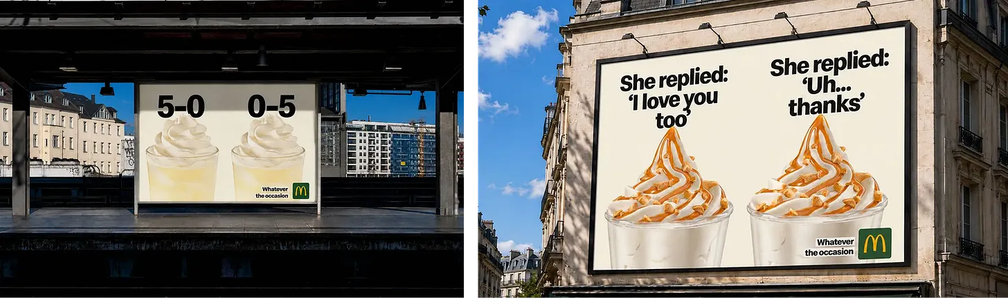
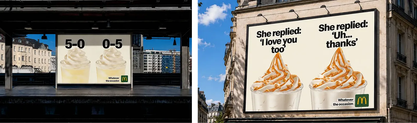
McDonald’s France made billboards with jokes on them. Remember jokes? Its July McFlurry campaign by TBWA\Paris pairs tiny victories and humiliations with the exact same product: “tells the joke” / “is the joke”, beauty / puberty, winning / losing. Very simple. Very stupid. Very good. No AI activation. No immersive
experience. No QR code leading to a microsite nobody asked for. Just ice cream and mild emotional damage.
🔗 Curated Links: Oddities & Inspirations
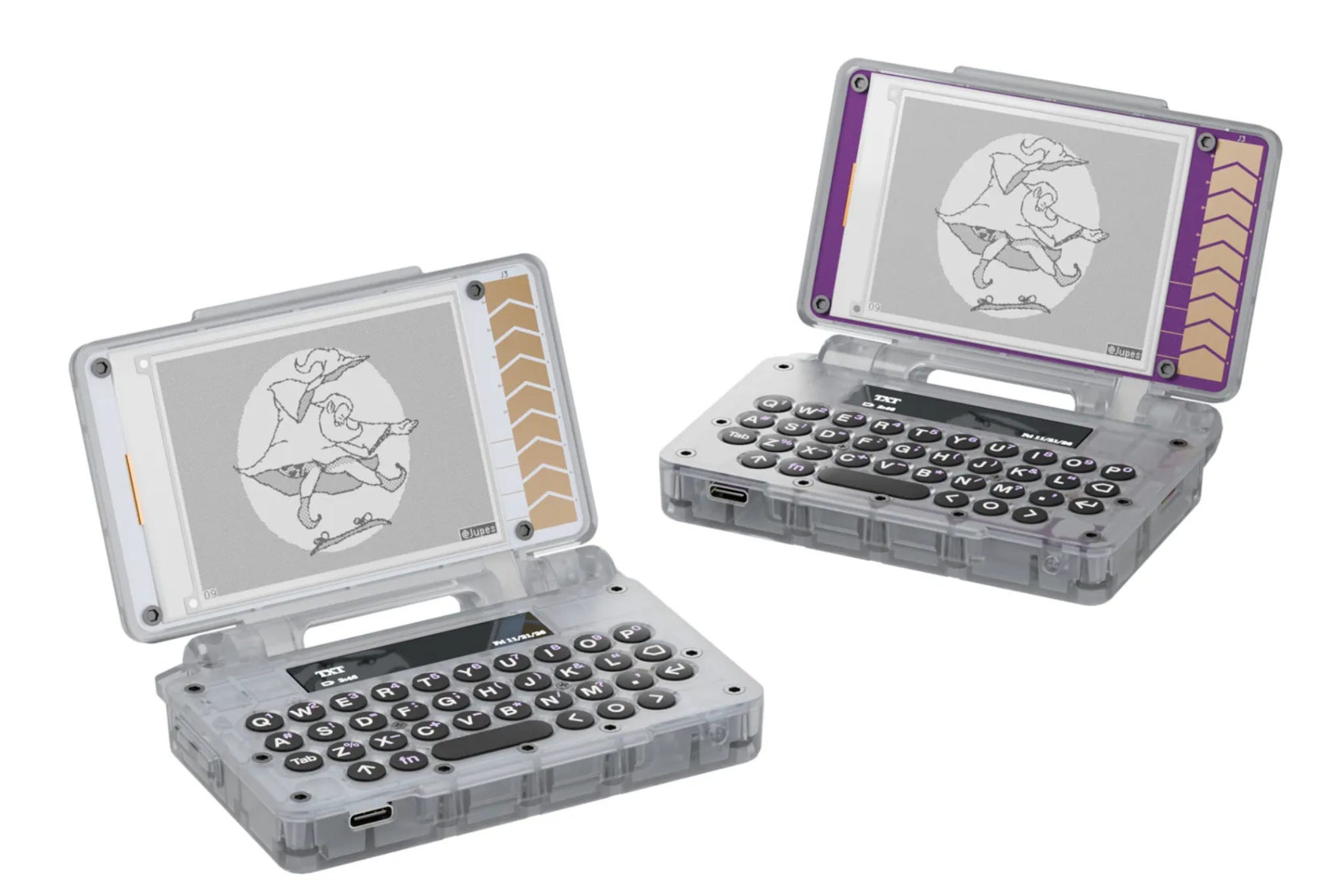
The Pocket Typewriter
The PocketMage is a tiny E Ink typewriter designed for writing without notifications, infinite tabs or the sudden urge to check Instagram. Somewhere between a BlackBerry, a cyberdeck and a homemade sci-fi prop, it combines a tactile keyboard with simple tools for notes, journaling and Markdown. You can even buy it as a DIY kit and assemble it yourself. It’s another oddly charming attempt to solve a modern problem by rebuilding a less convenient version of the past and honestly, we get it.
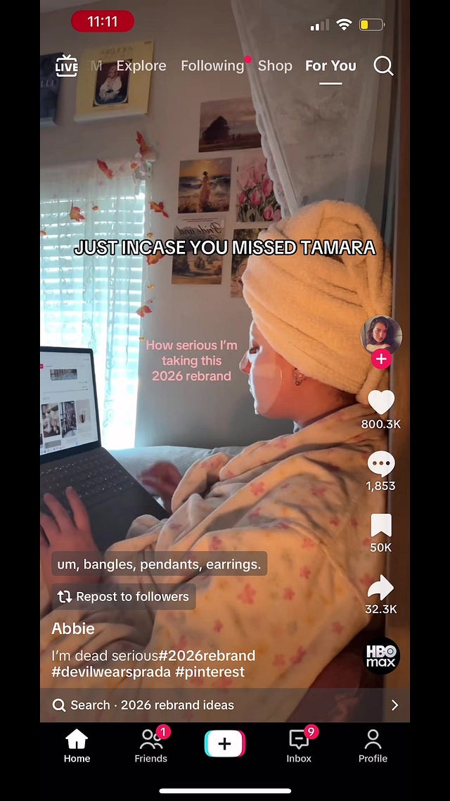
Nobody Knows What the 365 Buttons Mean
A TikTok user announced that she would carry 365 buttons – one for every day of 2026 – to become more present. When people asked what that meant, she simply replied that it only had to make sense to her. The refusal to explain became the meme: a tiny manifesto against turning every personal thought into public-facing content.
→ The strangely liberating story of 365 Buttons
 Tiktok failed to load.
Enable 3rd party cookies or use another browser
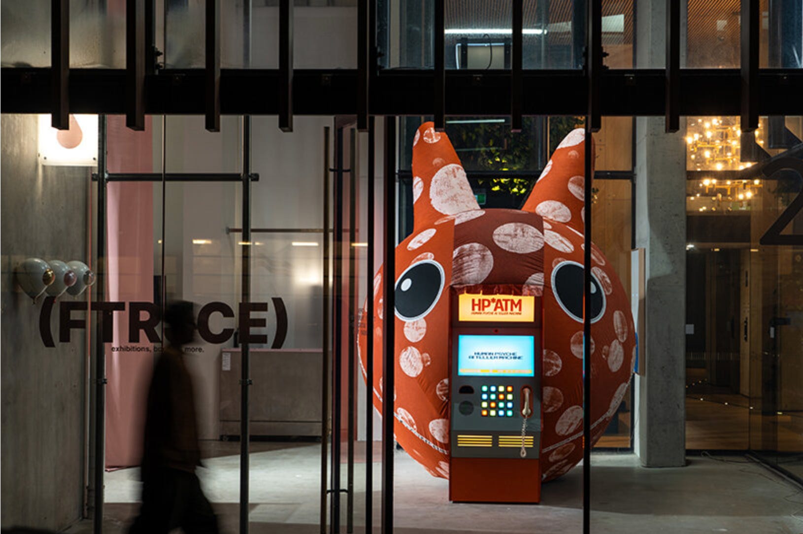
This Old ATM Thinks It Can Read Your Mind
Creative studio ENESS has turned a vintage cash machine into an AI-powered fortune teller. Instead of checking your balance, it analyses your face, palm and personal choices before printing a strangely poetic psychological reading. It’s playful, unsettling and not entirely different from what platforms already do with our data—just with a more dramatic receipt.
→ Check out the AI fortune teller
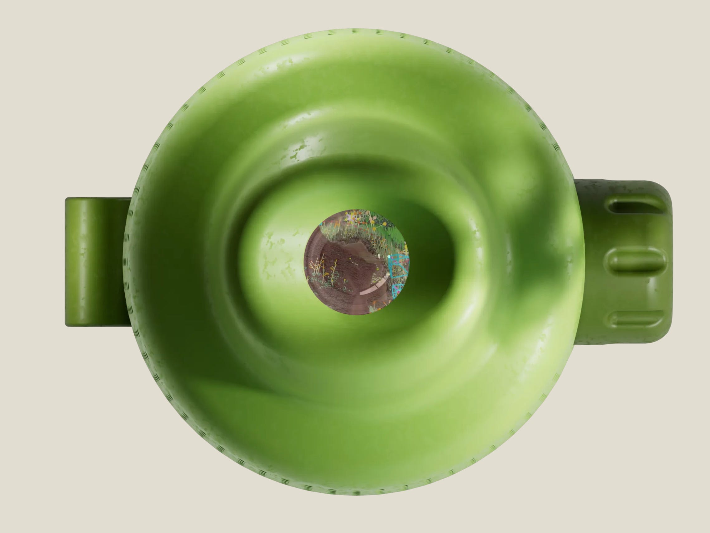
A Speaker With a Tiny World Living Inside It
Mur Mur doesn’t play songs or playlists. Instead, it contains a simulated miniature world whose weather, creatures and daily activity generate an evolving ambient soundscape. You can listen to a pond with ducks and passing boats, a forest with lost hikers or a tiny city complete with rush-hour traffic and pigeons. Like a digital terrarium, but for your ears.
✦ On Our Radar
Meet Lily, the Indonesian Designer Turning Nostalgia Into New Visual Worlds
On learning through recreation, building a visual language of her own and protecting the process behind design.
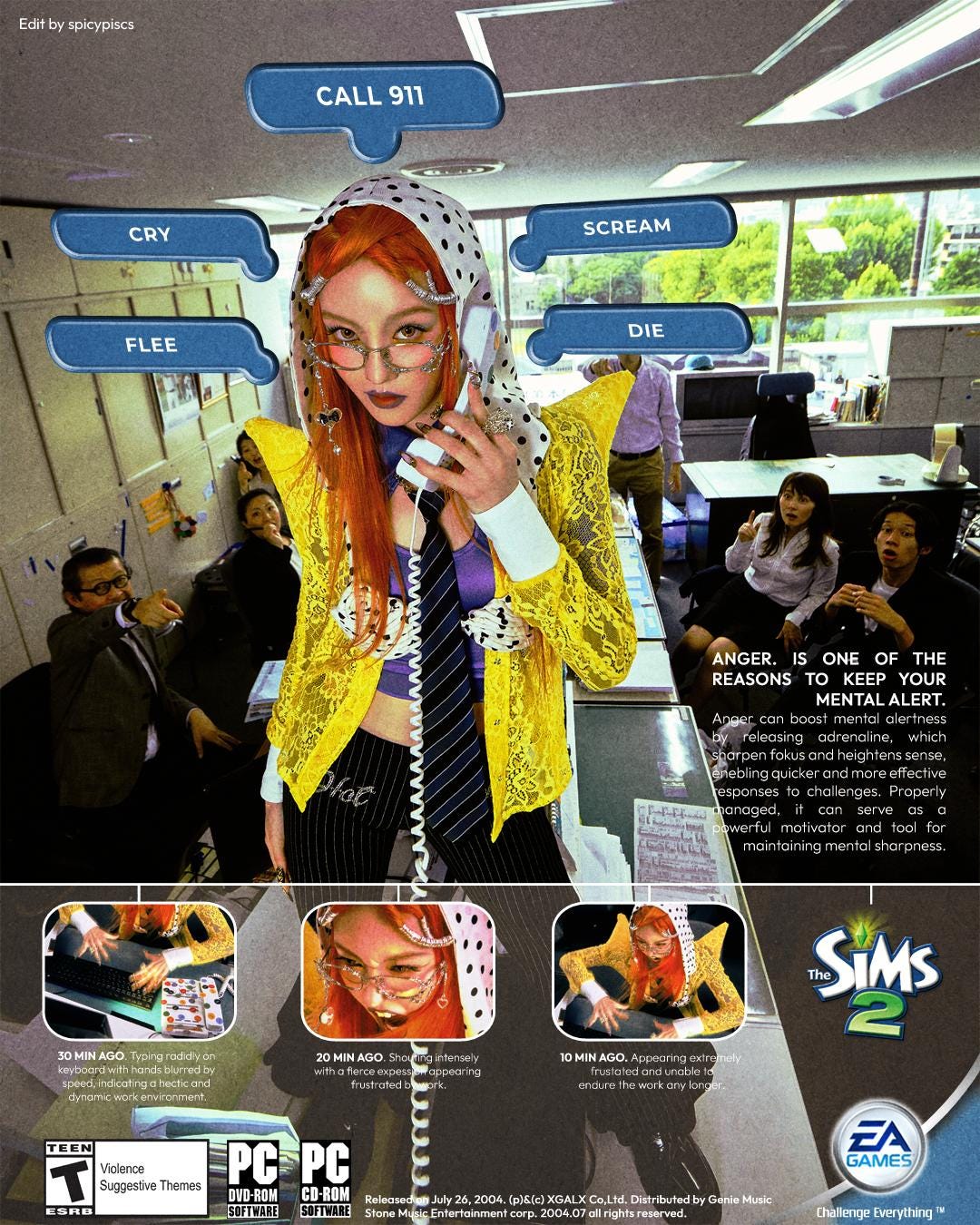
Working as @spcypscs, Lily is a graphic designer and visual artist from Indonesia experimenting with digital collages, experimental typography and visual storytelling. Her work mixes pop culture, retro imagery, bold colours and playful compositions with a distinctly nostalgic edge. Lily’s collages do not just look interesting, they set up whole little worlds to us.
Curious about how she develops that visual language, we asked where her process begins. For Lily, it starts with looking closely at the work that already holds her attention.
“I often recreate posters and visuals I find interesting as a way to study how they were made, from composition and typography to textures and colors.”
For Lily, recreation is a way of learning by taking an image apart. She studies how composition, type and texture work together, then carries those lessons into something of her own. That process matters to her, especially now that AI has made visual ideas easier to generate and creative work can start to look instant from the outside. Lily believes art and graphic design in particular, is still not always fully appreciated in Indonesia. The risk is that design becomes seen as something quick, replaceable and detached from the person making it.
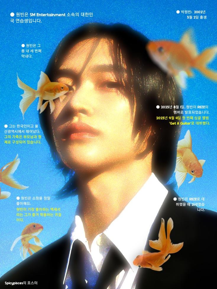
For her, design is never just the final image. It is the ideas, the choices, the time, the failed attempts and the process behind it. Even as technology makes creating easier, she still believes in learning by doing, experimenting freely and slowly developing a visual language of your own.


Lilias work taps into the pull of early-2000s visual culture: glossy gradients, game interfaces, pop editorials and the bright optimism of Frutiger Aero. She turns nostalgic visual references into playful little narratives, using type, texture and unexpected details to suggest a world beyond the frame.
Where to find Lily:
Instagram: @spcypscs
Pinterest: @spicypiscs
TikTok: @spcypscs21
📸 Visual Inspiration
E3 Show Dailies
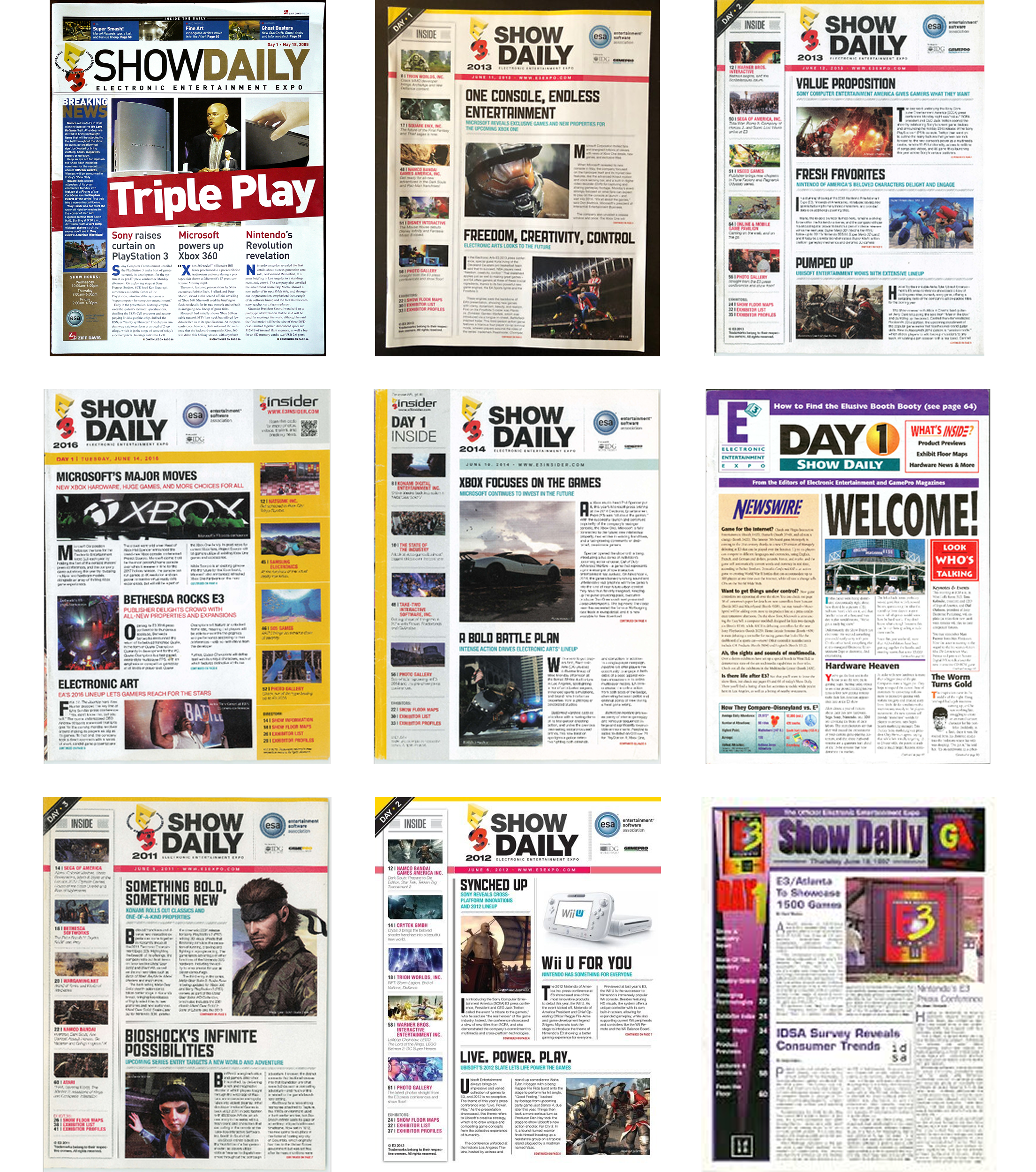
Before gaming announcements were tweets, livestreams and 40-minute YouTube presentations, trade shows produced actual daily newspapers.
The Video Game History Foundation archive contains surviving E3 Show Daily issues from across the expo’s history, including editions from the late 90s and early 2000s.
Huge headlines. Game renders fighting for space. Questionable Photoshop. Logos everywhere. The graphic-design equivalent of drinking six Monster drinks and opening Photoshop 4.0. Beautiful.
🎟 Pop-Culture Artifact of the Month
MySpace Is Planning Another Comeback
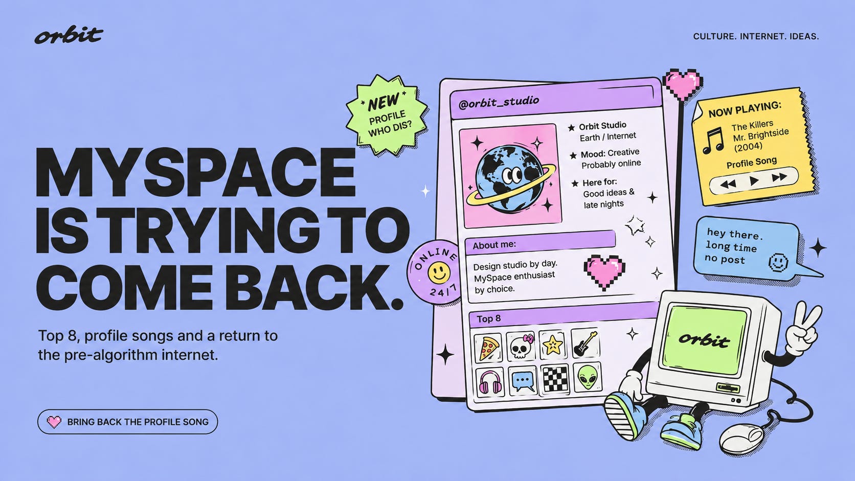
MySpace’s current owners, brothers Tim and Chris Vanderhook, say they want to relaunch the platform—although there is no date yet and not much has been revealed about what the new version will actually look like. What they do want is something that feels different from today’s social platforms: less driven by algorithms, endless scrolling and the constant fight for attention.
The interesting part is not only if anyone would genuinely return to MySpace. It is what people remember so fondly about it. Your profile was a tiny piece of the internet you could make completely your own. You chose the song, changed the layout, decorated it with questionable HTML and publicly ranked your closest friends. Subtlety was not the point.
Modern platforms are smoother and easier to use, but they also give us far less room to shape how we appear online. A MySpace comeback may or may not work. Still, the excitement around it reveals a real appetite for an internet that feels more personal, creative and slightly less controlled.
Thanks for reading!

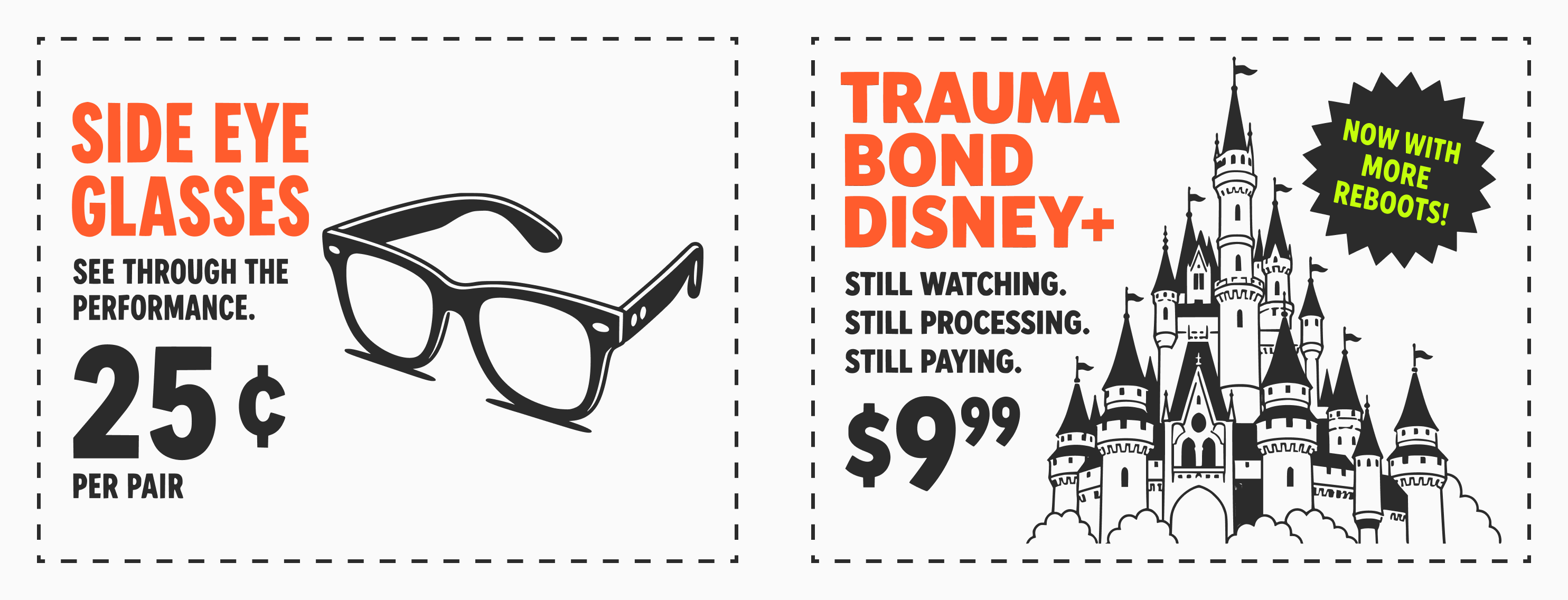
You’ve unlocked Coupon #0137. Keep collecting. There is no prize, only perspective.
This Substack is reader-supported. To receive new posts and support our work, consider becoming a free or paid subscriber.
🛸 – The Orbit Team

OMG, the Burger King boomer spot 😂absolutely insane in the best way. I need the merch and maybe have to go to France! Also love all the inspo, very well curated ✨