
🛸 The Orbit Dispatch: Issue #18
Disco-ball logos, offline internet energy, D&AD Pencil standouts, Cannes AI drama, copier-scanned McDonald’s, and a few glorious browser tabs from a better, weirder web.


Hello!
We’re back with your monthly dose of the bizarre and delightful in creative culture, design oddities, and internet curiosities. Grab a coffee, or whatever fuels your creative weirdness and dive in!
🌟 Fresh Orbit: Creative News & Quick Takes
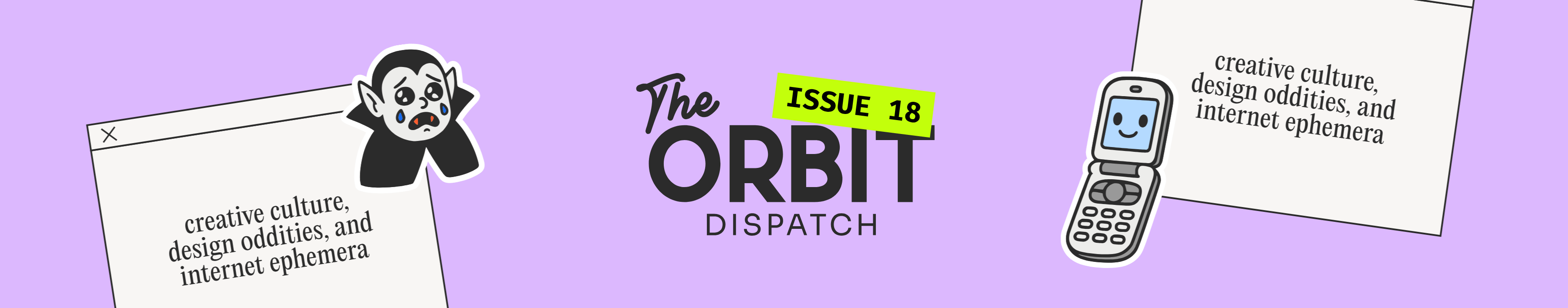
Spotify’s 20th-anniversary disco-ball app icon became a mini branding controversy: people noticed, complained & memed it. The “mirror-tile logo” look spread after, with other brands reportedly riffing on the reflective disco aesthetic

Pinterest launched a May 2026 brand campaign telling users to get inspired online, then go live offline. Pinterest’s positioning is basically: “We are useful internet, not doomscroll internet.”
The funniest platform contradiction of May: every app wants to be the healthy app. Pinterest says go outside, Instagram says post original work, YouTube says label AI, TikTok says trust our AI ad stack. Everyone is selling detox from the system they helped build.
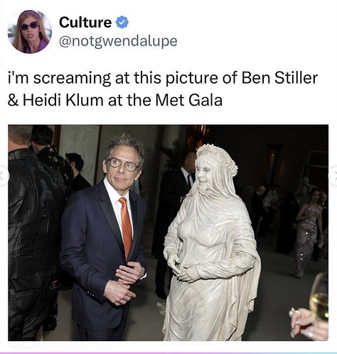
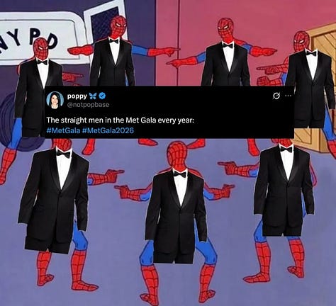
The 2026 Met Gala happened on May 4 in New York. Yaaawn. We are lurking just for the memes.
D&AD 2026 awarded 573 Pencils across 46 categories. That is a lot of creative excellence, or at minimum a lot of extremely heavy shelf objects.
GifCities was originally launched in 2016 for the Internet Archive’s 20th anniversary and was updated in 2025.** So by May 2026, the old GIF archive had become newly relevant again inside the nostalgia wave.
Darren Aronofsky defended AI at Cannes as an “expanded cinematic toolbox.” The most Cannes sentence imaginable: a serious auteur, a controversial technology, and everyone pretending the future of cinema is being decided over canapés.
The new luxury brand move: don’t look desperate online. Bottega-style social restraint, literary clubs, run clubs, art fairs and offline experiences are becoming brand signals. Less “please share this,” more “you had to be there.”
The “offline internet” became a brand aesthetic. Pinterest says go outside, fashion brands host literary clubs, Cannes turns influencers into IRL spectacle, and everyone tries to make digital culture feel physical again.
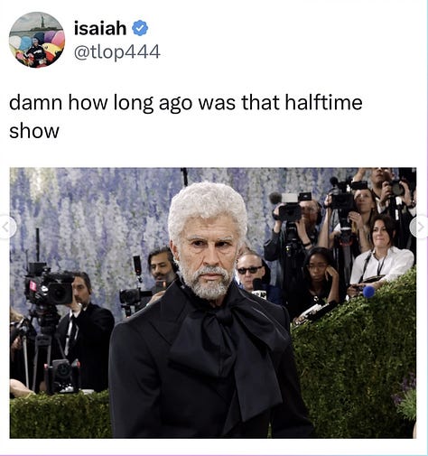
Susan Boyle’s sudden Instagram rebrand looked suspiciously like a campaign. Vogue noted that she wiped her feed, debuted a glam new look, posted with “#ad,” and seemed to be teasing a new era. A 2009 viral star being repackaged for 2026 social culture is very internet-time-loop.
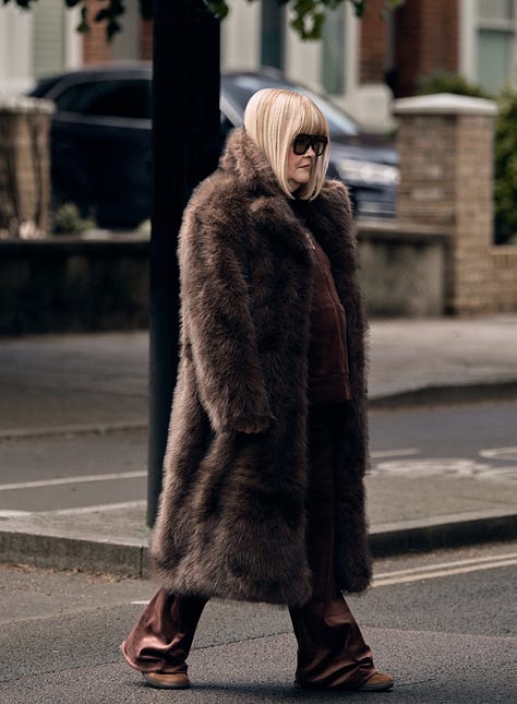
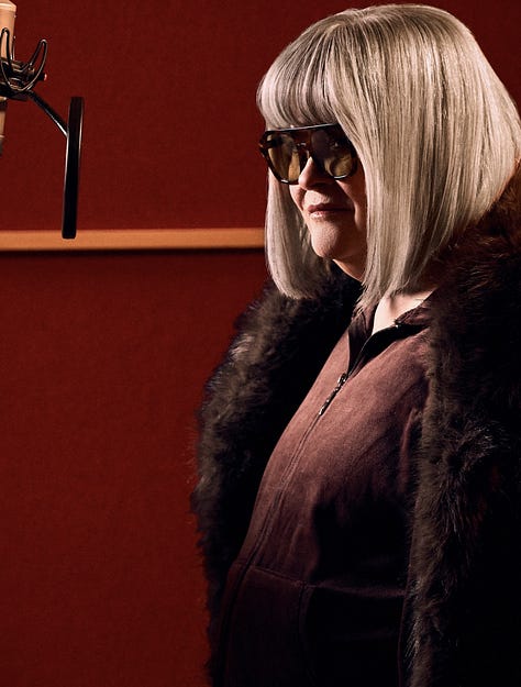
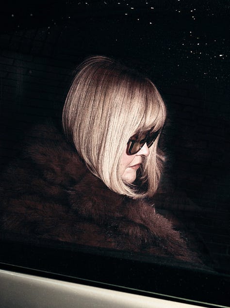
Susans Boyle´s Instagram Rebrand


Substack-style direct channels are part of the influencer shift. Vogue noted newsletters and more direct-to-consumer communications as brands look beyond saturated feeds for trust and depth.
Coca-Cola is already warming up for the FIFA World Cup 2026 with limited-edition football-shaped bottles at Walmart. Will people buy it, photograph it and keep it in a cupboard for 14 years? Obviously.
✏️ The Curious Cases from D&AD Pencil Awards
We were lucky enough to attend this year’s D&AD Festival, and even luckier to get a glimpse behind the curtain by shadowing judges in a few categories. It was one of those rare industry moments where the case films, craft, and conversations actually punched through the noise and stayed with us.
These are the cases that turned our heads the most:
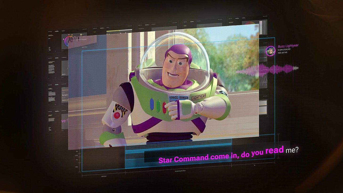
1. Caption with Intention — captions finally get cinematic
Brand: Chicago Hearing Society
Agency: FCB Chicago, Rakish Entertainment, Chicago Hearing Society
Awards: 1 Yellow Pencil, 9 Graphite Pencils, 4 Wood Pencils and 8 Shortlists across its D&AD 2026 run.
Why it won: It reimagines closed captions as a proper storytelling system, not just white text at the bottom of the screen. The system uses character colours for speaker attribution, precise timing, and variable type to show volume, pitch, emotion, and intention. It was co-created and tested with the Chicago Hearing Society, recognised by the Academy of Motion Picture Arts and Sciences, and made open-source for studios and creators.
Our take: For 50 years, captions basically said: “someone is speaking.” This asks: what if captions could act, whisper, scream, interrupt, and carry emotional subtext? Accessibility becomes art direction.

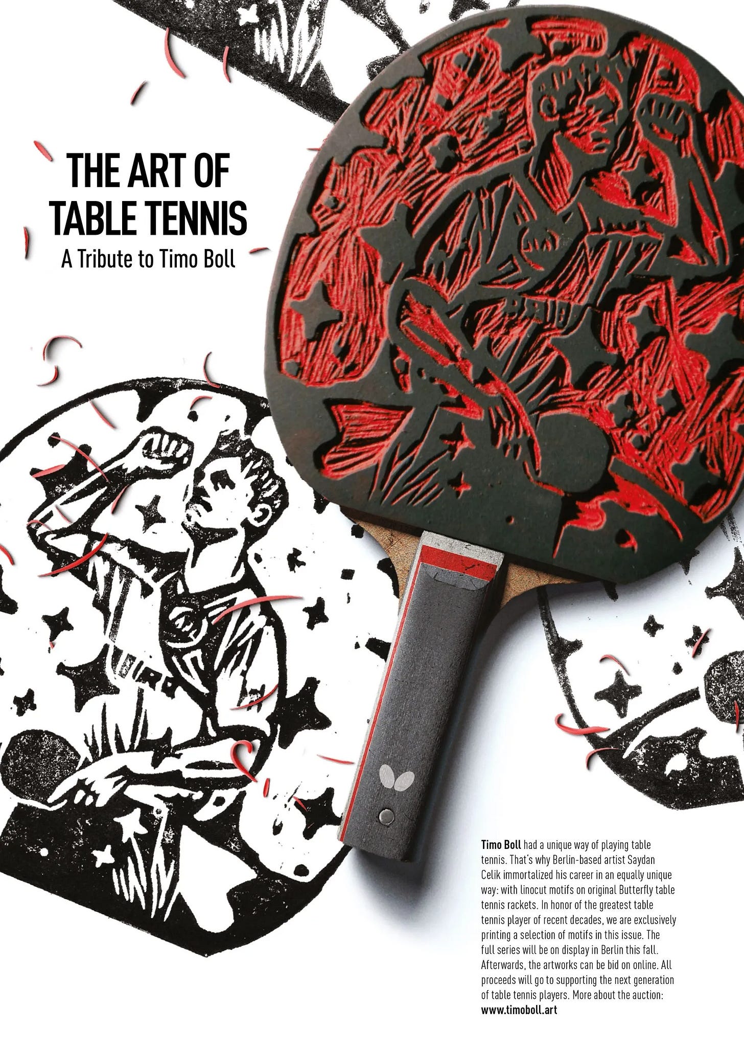
2. Butterfly — The Art of Table Tennis: A Tribute to Timo Boll
Brand: Butterfly
Agency: Jung von Matt Hamburg; Saydan Çelik / Jung von Matt HAVEL
Awards: Wood Pencil in Art Direction, plus a Shortlist at D&AD 2026.
Why it won: After table tennis legend Timo Boll retired, Butterfly turned eight of his original rackets into hand-carved linocut printing plates. Each racket depicted a key moment from Boll’s career, and the prints became fine-art posters, ads, a brochure, and an exhibition during Berlin Art Week. D&AD lists it as a 2026 Wood Pencil winner, while Saydan Çelik described it as “no budgets, just 8 rackets” and a handmade idea around love for the sport.
Our take: A sports tribute that literally turns the athlete’s tools into printing tools. Very nice: racket as archive, racket as relic, racket as poster machine.

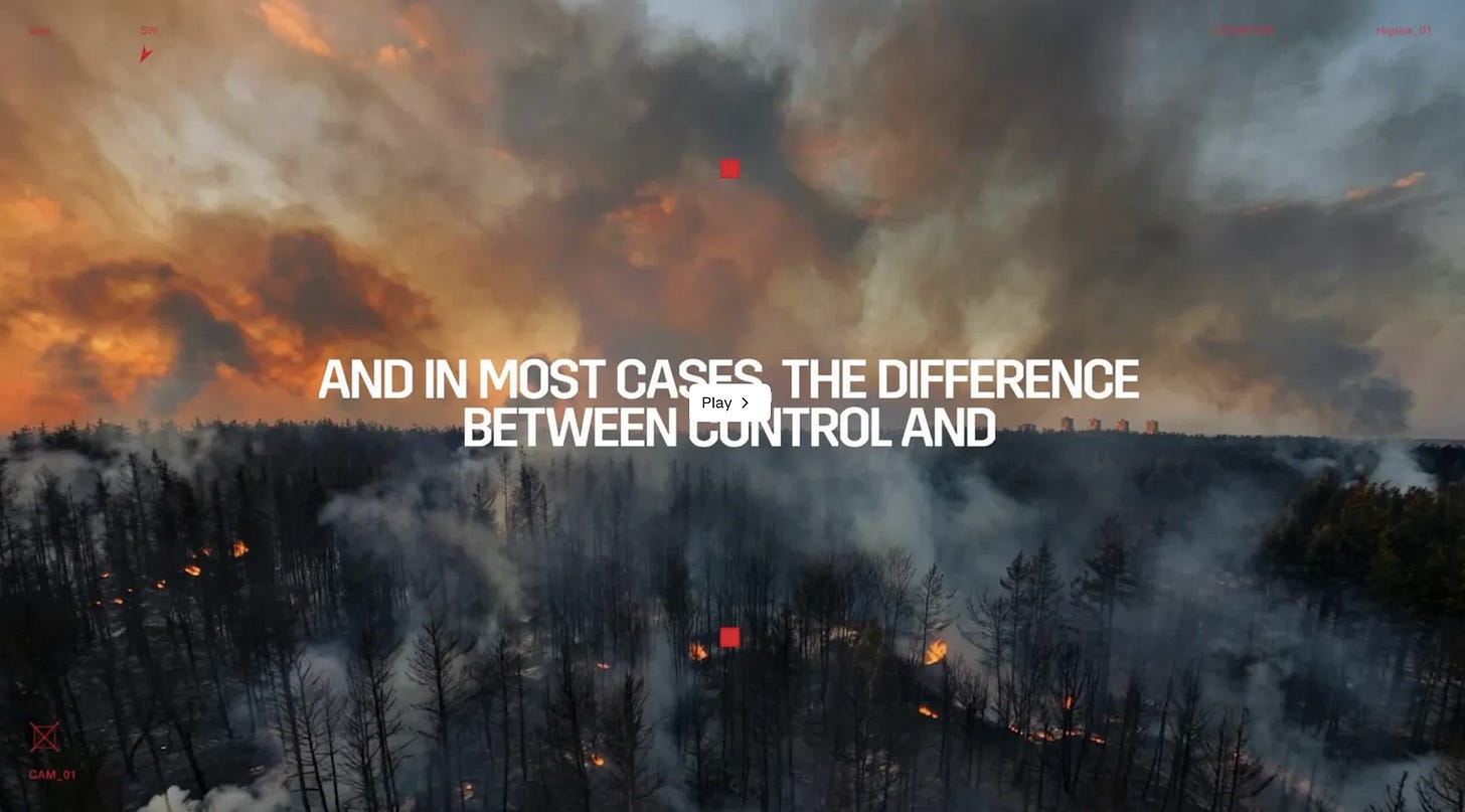
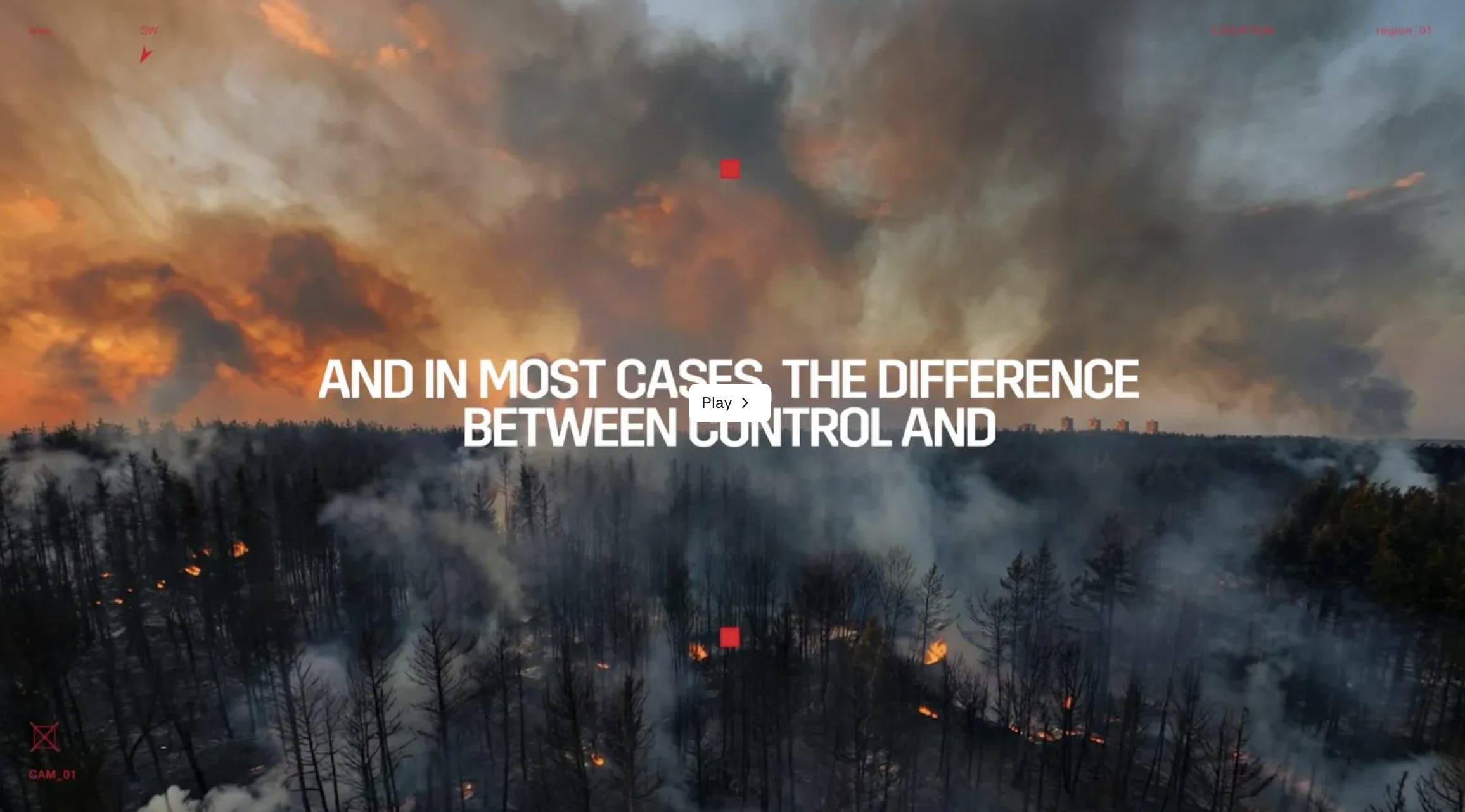
3. Firecatchers — turning Twitch “starting soon” screens into wildfire surveillance
Client: Sapeurs-Pompiers de France
Agency: Havas Play France
Country: France
Awards: D&AD 2026 Graphite Pencil + Wood Pencil, Creator Content / Media
Why it won: Firecatchers used a dead bit of livestream real estate—the “starting soon” screen on Twitch—and turned it into a civic warning system. Instead of showing static countdown graphics while audiences waited for streams to begin, creators broadcast live surveillance footage from wildfire-risk zones. Viewers waiting for entertainment became a distributed lookout network, helping spot potential fires earlier. D&AD describes the idea as transforming “waiting time into watch time.”
Our take: A perfect internet-native public-safety hack: the most boring screen on Twitch becomes a firewatch tower. It’s very 2026—creator culture, livestream habit, climate anxiety, and civic infrastructure all mashed into one “stream starting soon” rectangle.
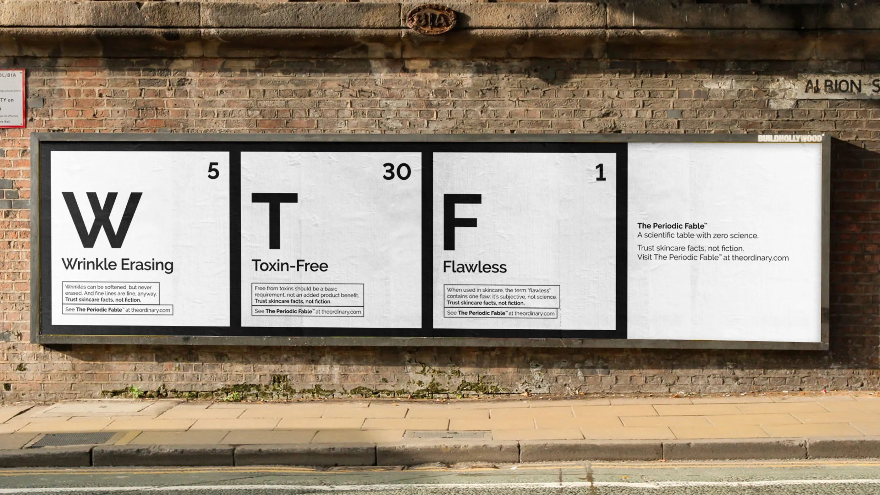
4. The Periodic Fable — The Ordinary turns beauty nonsense into a fake science table
Brand: The Ordinary
Agency: Uncommon Creative Studio
Awards: 3 Yellow Pencils, 2 Graphite Pencils and 4 Wood Pencils at D&AD 2026.
Why it won: The campaign created a “scientific table with zero science,” replacing chemical elements with 49 skincare marketing buzzwords. It attacked the overblown language of the beauty industry—“poreless,” “clean,” “detox,” “miracle” energy—while staying totally on-brand for The Ordinary’s radical transparency positioning. It extended into OOH, social, influencer activations, and a surreal classroom film. D&AD describes it as a critique of trend-led, overconsumption-driven beauty culture.
Our take: A fake periodic table for fake beauty science. It feels like school, satire, packaging design, and category roast all in one.

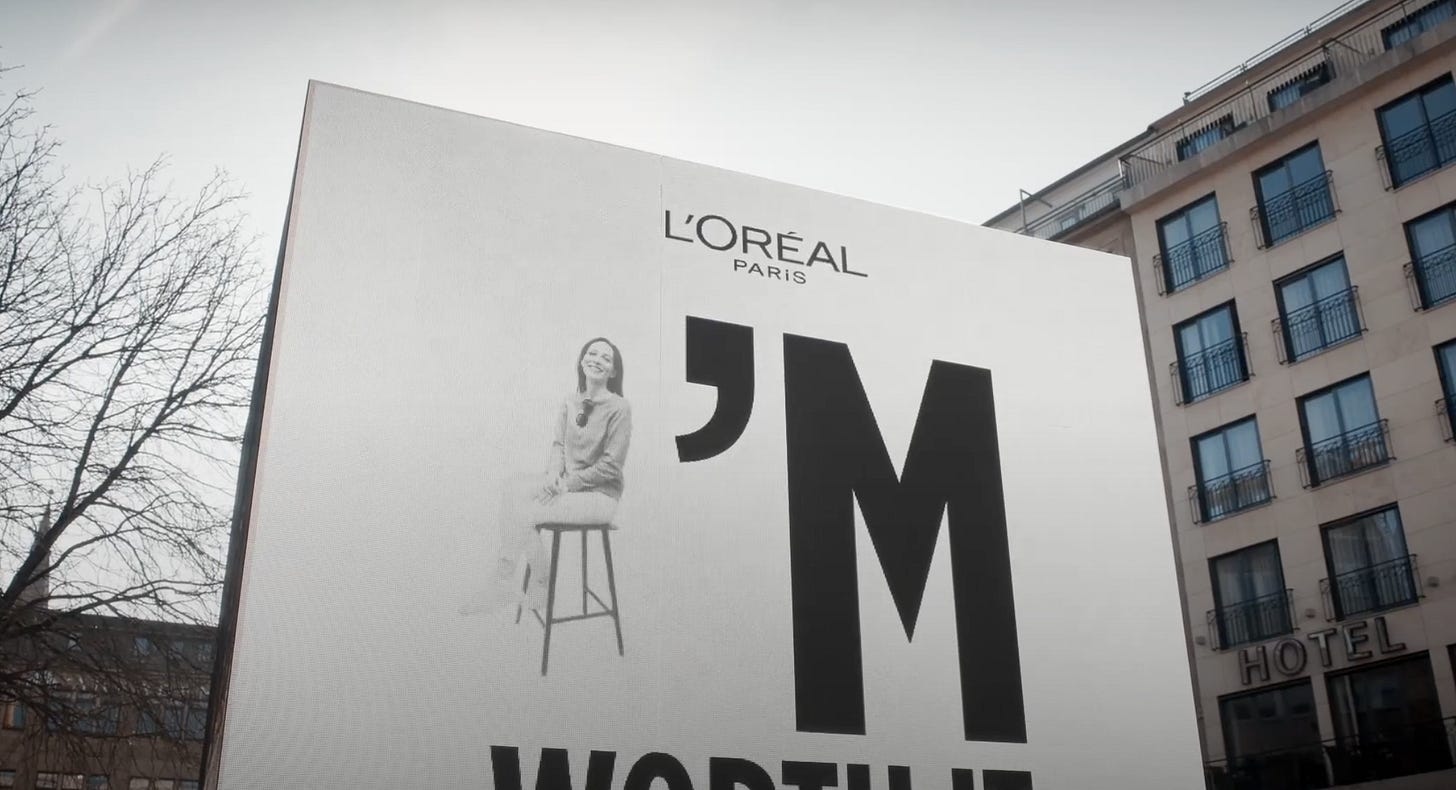
5. The Final Copy of Ilon Specht — the woman behind “Because I’m Worth It” gets the last word
Brand: L’Oréal Paris
Agency: McCann / L’Oréal Paris
Awards: 2 Yellow Pencils, 2 Graphite Pencils and 1 Wood Pencil at D&AD 2026, across categories including Film, Entertainment, Direction, Media and Editing.
Why it won: This 17-minute branded documentary tells the story of Ilon Specht, the young copywriter who wrote L’Oréal’s iconic “Because I’m Worth It” line in the 1970s. D&AD describes it as a branded film that crosses into “pure cinema,” with no product pushing. It appeared on AMC+, Prime Video and became the first branded content acquired by TED.
Our take: A beauty brand wins by doing the least “beauty ad” thing possible: letting an old copywriter talk about rage, feminism, authorship, and the four words that outlived almost every campaign around them.'
🎟 Pop-Culture Artifact of the Month
McDonald’s Office Delivery: The Copier Ate (2026)
Awarded for: Best Use of Office Equipment in the Name of Lunch.
For its Office Delivery campaign, created by TBWA\Paris and directed by Elias Levy, actual McDonald’s items were placed on a copier glass and scanned like suspicious lunch evidence. Big Mac. Fries. Nuggets. Drink. Even the ad copy was printed, stuck onto the scanner and absorbed into that weird fluorescent office-document glow.
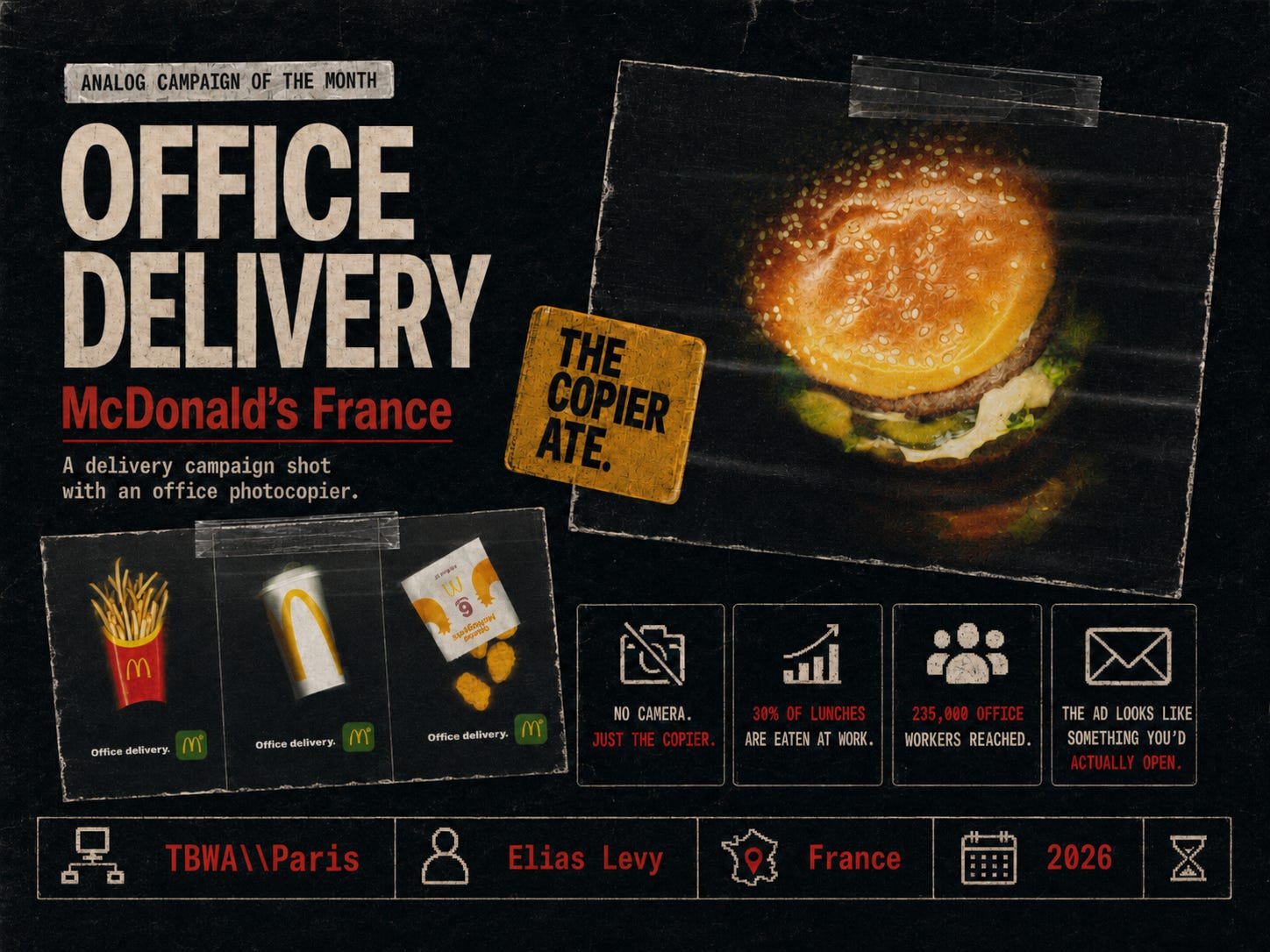
The insight is simple: a huge amount of lunch happens at work. McDonald’s moved the ad into the place where the craving actually happens: the inbox, during lunchtime and between meetings, while your brain is running on 8% battery and someone says “quick lunch?”.
It is not polished in the traditional food-ad way. The burger looks flattened. The fries look like evidence. The whole thing has the visual dignity of a tax document. But that is exactly why it works.
🔗 Source: Famous Campaigns
💿 Album Art of the Month
Stefan Sagmeister’s Aerosmith’s Nine Lives cover
Stefan Sagmeister’s story about Aerosmith’s Nine Lives cover is basically the final boss of album-design chaos. What started as a dream Sony Music brief—big band, big budget, Indian-inspired music, perfect title—slowly turned into a cursed CD-ROM of rejected ideas, expensive paper engineering, religious complaints, Walmart nipple panic, legal threats, and invoices that apparently went wandering off into the void.
The original concept was genuinely beautiful: a cut-out booklet where a cat would transform page by page, playing with the idea of “nine lives.” Everyone loved it, until the extra production cost—just 16 cents per CD—killed the magic. The replacement cover then triggered complaints from a Hindu sect, got censored by Walmart over snake-creature nipples, and nearly left Sagmeister’s tiny studio on the hook for a massive settlement.
His D&AD Festival lesson was brutally simple: when too many people steer the ship, the ship does not become more strategic. It becomes a floating mood board with legal problems.


🔗 Curated Links: Oddities & Inspirations
Poolsuite.com A Browser Tab From a Better Internet
Poolsuite feels like a tiny fake operating system built by internet friends with a suspiciously strong commitment to leisure. Born in the Highlands of Scotland, the project describes itself as a small collective making things online, hosting parties, making sunscreen and generally bringing warmth to its community of listeners. It’s internet radio wrapped in pixel type, pop-up windows, low-res glamour.
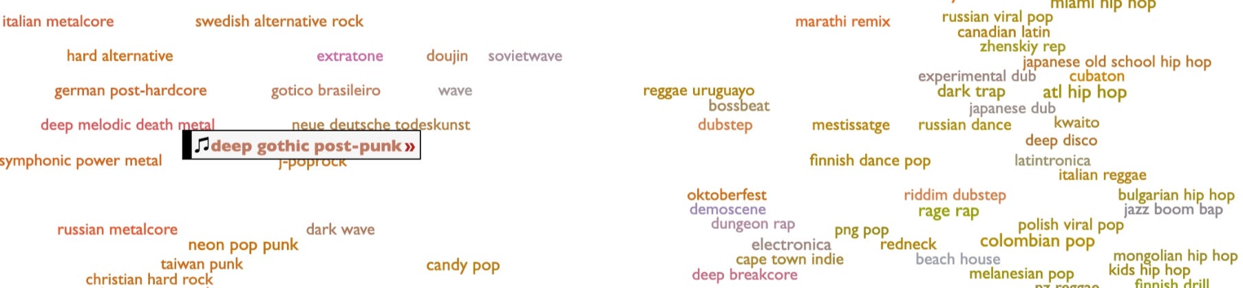
A visual map of every single music genre on Spotify — over 6,000 of them. Click any genre and it immediately plays a sample. Discover that “Norwegian Worship,” “Drab Pop,” and “Danger Clown” are real and distinct genres. An afternoon is not enough.
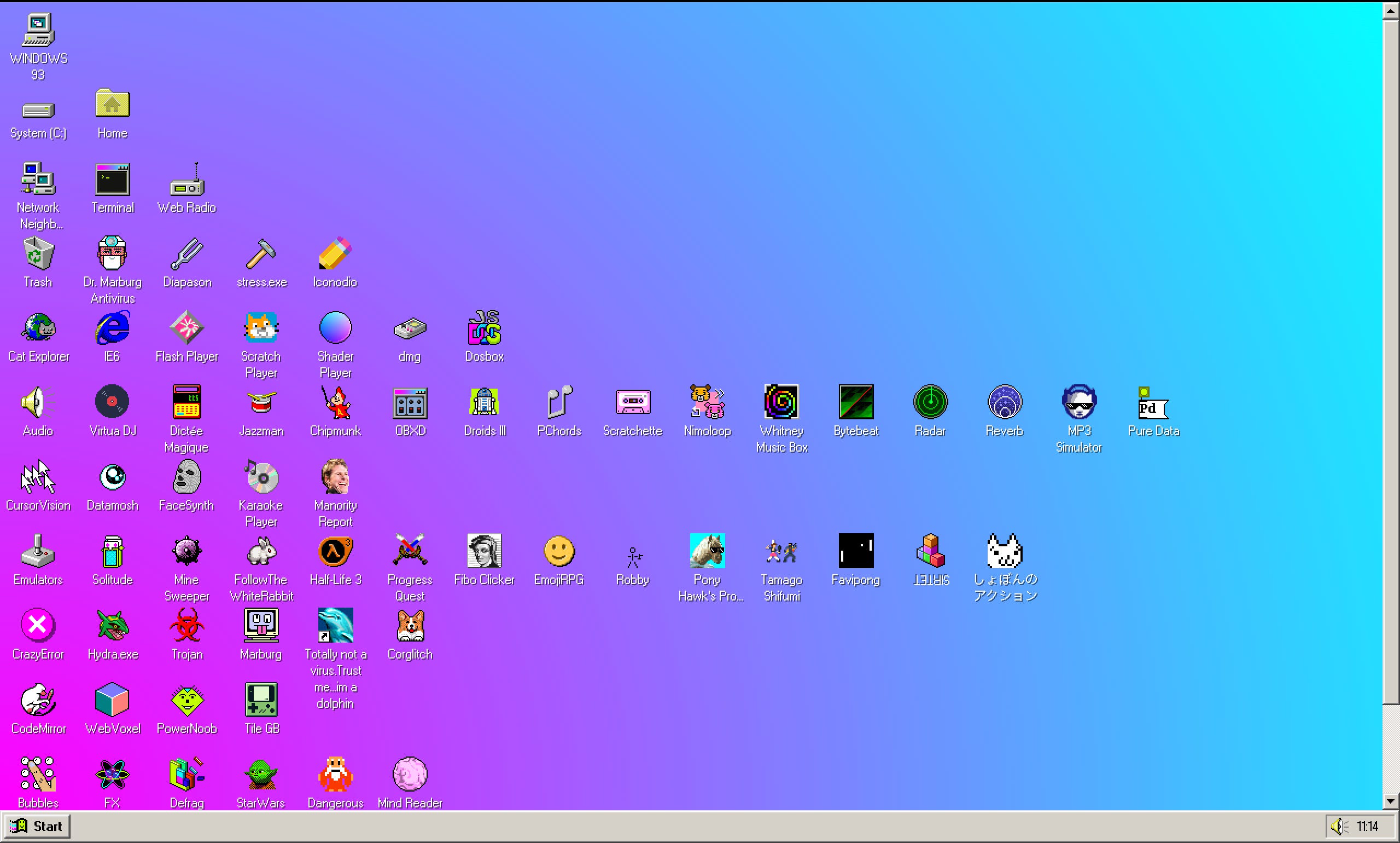
The kind of interface that makes you want to click everything just to see what happens. A fully functional surreal parody operating system that runs in your browser. Solitaire, a virtual desktop companion, pop-up windows that multiply when you try to close them, and a musical defrag utility. Built as a web art project. Somehow more interesting than your actual desktop.
A portfolio you navigate by driving a tiny 3D car. Created by a French developer who decided a website should be a place you move through. Still the best example of what a personal website can be if someone cares enough.
🤔 Poll of the Month
Thanks for reading!
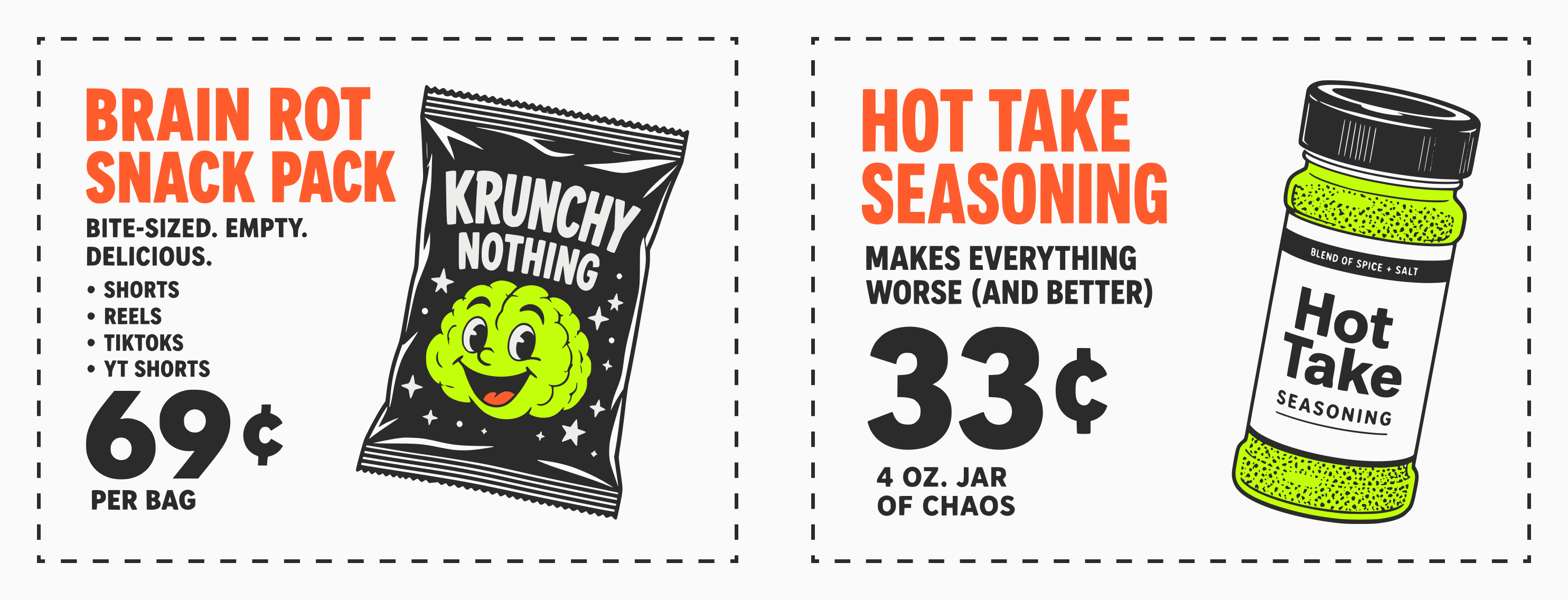
You’ve unlocked Coupon #016. Keep collecting. There is no prize, only perspective.

Thank you for these enjoyable retrospective. ☺️